

Fully Funded Residencies (FFR) is a nonprofit organization that runs an online platform for research and knowledge-sharing that gathers, archives and shares fully funded residencies, awards, grants and mobility funds. What makes FFR different from other major open call websites is that they gather and share only opportunities that provide fair compensation for artist’s time and work.
The FFR team consists of nine multidisciplinary artists. They have a website and use social media platforms where they regularly post new artist opportunities. Over the past few years they have gathered a significant following but their website has stayed behind. Built with limited resources, it is difficult to navigate and does not match their recently updated visual identity.
I was contacted by the team asking for a new website design.
Design a website that displays current open calls (with deadline, location, support) with a search & filter function. They described their dream solution as:


In addition to these requirements, they described their visual preferences as “playful cool looking kind of design”. As a jumping off point for the visual side of things, I had the excellent work of Nima Keshtkar, who has designed their logo and brand identity.

The first step in the design process was to do a heuristic evaluation of their current website:

Main usability issues:
• no option to search or filter the long list of open calls
• a lack of hierarchy within the open calls information which makes it difficult to scan through
• no clear CTA: unclear where one has to click to get more info and no indication of a new tab opening with the source website for the open call
• navigation bar has ambiguous labels
• no consistency in image sizes & text alignment which negatively impacts readability
The Stakeholders
To expand my understanding of the problem, I spoke with the FFR team members who had some valuable insights to share from their experience with running the website. They pointed out some must-have elements such as “last updated” information as well as the importance of the different kinds of open calls they post (for residencies, for grants, for mobility funds some of them being ongoing and some limited by a deadline).
The FFR team members, being all artists themselves, had their own preferences when it comes to looking for opportunities. Sharing a background with their users certainly has its benefits. On the other hand, this comes with its challenges because the stakeholders saw themselves as the users. Going into this project, I knew I would have to keep a balance between the needs of the stakeholders and those of their users.

The Users
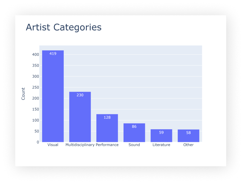
After outlining the basic usability issues, talking to the stakeholders and considering the brief, I wanted to understand who is using the website and what are their primary needs. Luckily, the FFR team has recently made a survey with their users and they shared the results with me. They reached 452 people, most of them artists.


• Users’ age distribution: 25 - 40
• The users are mostly artists (89% of the participants in the survey) in a wide range of fields.
• When looking for opportunities, the top three considerations are: financial support, location and duration.
• The category of “artist” is quite broad and encompasses people from different fields and practices. Designing for a range of uses would be a good idea: a design that is adaptable to the individual needs
• Make the top three considerations when looking for an opportunity into quickly accessible and scannable info about each open call.
The survey data, combined with the stakeholder interviews and my own experience as an artist gave me a good understanding of how artists are using the Fully Funded Residencies website. To keep their requirements in mind throughout the design process, I created a proto-persona.


In order to understand what pages or functionality will be needed for Ben to accomplish his goal, I mapped out a User flow.

Working out the User flow, brought up another important question about the business objectives: Do we need to keep users on our website as long as possible or do we want to quickly guide people to the original source of the opportunity?
The current website leads users directly to the source where they can find all the relevant information. However, the FFR website offers other resources such as help with writing applications, useful tips on residencies and more. To better understand their objectives and future plans, I talked to some of the FFR team members.
Their main priority is to be a platform for open knowledge sharing where people can contribute to the content published. This goal is also reflected in the service they provide and want to eventually expand in the future: offer help with writing an application with a donation based fee (pay what you can method in order to keep the offer accessible).
The design decisions that followed from those observations were:
• To keep users longer on the FFR website, have a detailed description of the open call
• Highlight Resources and useful information on the landing page
• Add CTAs about contacting the FFR team for help and contributing with an open call
• Have a clear objectives description in About page to aid transparency and create trust
I then iterated on my inital version of the Sitemap, taking into consideration the findings from the Open Card Sort.
Before jumping into redesigning individual pages of the website, I made a list of all the content there is. The current website does not have clear categories, and there is a lot of different content inside the “Keep an Eye on” category (grants & funds as well as useful links on applications and institutions from other websites).
To better understand how to group and arrange the content of the website, I did an Open Card Sort.


Considering the importance of the visual design, the requirements for the design to be adaptable and appealing to a wide range of artists and stakeholders, I decided to work on three mid-fidelity designs. This helped me start a conversation with the FFR team about the visual design preferences while also presenting the new structure and user flows of the website.
In a meeting with all nine team members of FFR, I presented the three solutions as basic prototypes.
“Too corporate looking”

“It’s a bit boring.”

“I love the big logo but don't hide the menu behind a hamburger.”

In the session everyone was given the time to express their opinion and give feedback. With nine artists participating, it was no surprise that the individual preferences were conflicting and pulling the focus in different directions.
Instead of ignoring the individual preferences about colors and visual design, I managed to align the stakeholders by reminding them about the important aspects of the project:
• a design that is easy to use and covers the needs of a wide range of users (artists).
• a design that offers all the necessary functionalities for the users to quickly find what they are looking for.
• a design that clearly states the purpose of the website and highlights the team behind it.
Moreover, we all agreed that the purpose is to design not for our own use but for the artists that are looking for opportunities. I managed to align the team on those points, and communicated the next design steps in the process:
• Combine the three versions into one taking into consideration the feedback.
• Test this consolidated version with actual users.
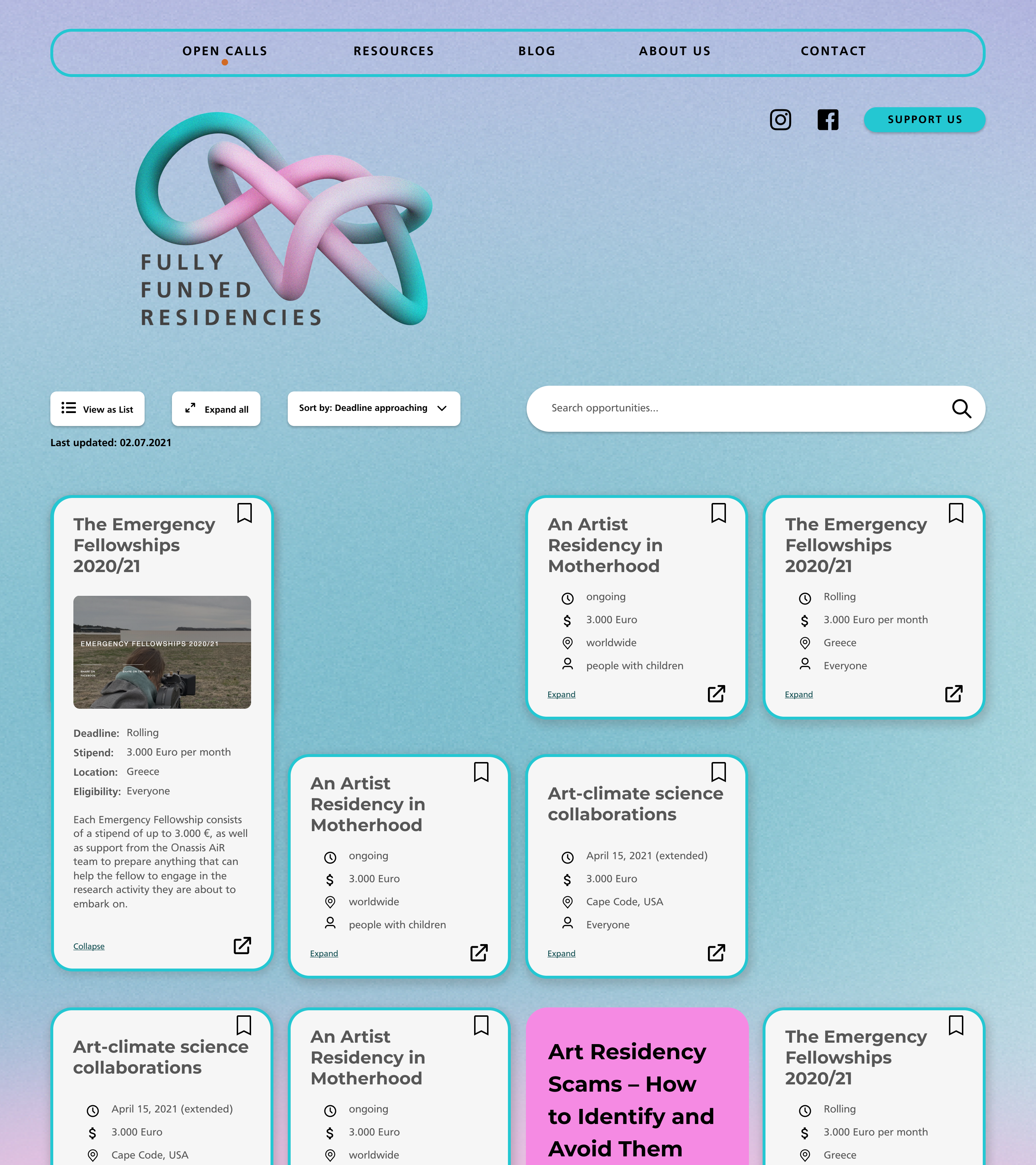
The feedback session helped us come up with some creative solutions of how to incorporate different modes of visualization and use. By having the team members describe themselves as more “visual person” and others as having a “minimalistic approach”, I made the design decision to have both a visual way of viewing the open calls and a simple list view. That way the broad range of artists using the website could have the opportunity to adapt the design to their preferences, making them feel assisted and accommodated in their search for opportunities.
For “the minimalistic approach”

For “visual people”

I conducted moderated (remote) usability tests with 5 users: 3 artists; 1 art historian and 1 designer. Two of the participants in the usability test have used the FFR website before and the other three were unfamiliar with it. A clickable prototype was tested.
I analyzed the results and used a rainbow spreadsheet to prioritize the discovered issues by severity. The major problems that needed addressing were:
• The “expand” and “open in new tab” icons were ambiguous.
• Тhe four different ways of viewing an open call card (short view, expanded view, full-window view, list view) were confusing.
• The landing page was overwhelming because of missing spots in the grid and lack of page titles.
• Users were uncertain where to find the Filter option and did not expect it to be triggered by the Search bar
For a detailed view of the Rainbow Spreadsheet click here.


The FFR team wanted their website to have a playful tone, yet be simple and scannable. Based on the logo and colors the FFR already have, I decided on a gradient for the background and pastel colors for accent. The important information is then arranged into cards with gray background and clear structure.
After addressing the usability issues in a next iteration of the design, I had another feedback session with the FFR team. I presented the findings from the usability test and the decisions that followed from there into the latest iteration of the design.
They were pleased with the design and surprised at my ability to consider everyone’s feedback, preferences and the users’ needs and bring it all into one coherent design.


Throughout the design process I have been in contact with the developers who are going to build the website. We discussed the most important functionalities, and considering the time frame for executing, decided to put aside some features for the next iteration of the website.
• Bookmark functionality and a user profile section
• An archive page with past open calls
• Mobile version of the website
The finished redesign of the website considers some of the Web Content Accessibility Guidelines (WCAG) 2.0 such as color contrast and the list view of the open calls adds to the accessibility of the page. However, the color palette and the size of the text might make the use of the website difficult for some users. In the future iterations of the website, I would like to add:
• ability to resize the content on website
• option to switch off the background colors
• adding a dark mode
Some of these issues could be addressed at this stage of the project and I am working closely with the developers to plan the implementation of those accessibility improvements.

The biggest challenge in this project was to find a balance between the needs and requirements of the stakeholders and those of the users. The FFR team consists of 9 artists so they see themselves as the users. They each had their own unique perspective and opinion about the redesign, which resulted in the project being pulled into different directions.
I managed to align the team by having regular feedback sessions with them where I presented insights from the user research. I communicated my design decisions, stressing why and how these steps in the design process will benefit the end result.
Designing for a very broad range of users — the FFR website is used by artists in a variety of fields and practices — was another major challenge and learning opportunity. The way the content, in this case hundreds of open calls, is displayed is crucial in determining if users engage or abandon the website. By looking for best practices, I was able to adapt some of them to the unique context of this project. I worked on different designs that would accommodate different ways to organize and visualize the content and combined them into one design that is adaptable to individual needs.
Icons by Material Design
Logo and visual identity by Nima Keshtkar.
Follow Fully Funded Residencies on Instagram and stay tuned for the new website launch!

